Back to Work B2C Ecommerce

Transforming Homzmart into a More Confident Shopping Experience

Redesigning the e-commerce journey to make a large furniture catalog easier to explore, help shoppers evaluate products with confidence, and reduce friction through checkout.

Role
UX Team Lead
Company
Homzmart
Timeline
2020–2021
Product
Furniture e-commerce
Contribution
Research · UX Strategy · UX/UI · Team Collaboration
Surfaces
Web · Responsive / Mobile
Illustration of a warm, softly lit living room with a sofa and decor

01 The Challenge

Buying furniture online asks users to make a high-consideration decision without physically seeing or trying the product.

Homzmart already offered a large furniture and home-goods catalog across web and mobile. The opportunity was not simply to refresh the interface. We needed to make it easier for shoppers to discover relevant products, understand what they were buying, and move through the purchase journey with greater confidence.

The business and user tension

Business needed

Stronger product discovery, better merchandising, and a shopping experience capable of supporting growth.

Users needed

Faster ways to find products, clearer product information, and more confidence before committing to a furniture purchase.

Our opportunity

How might we make Homzmart easier to explore and safer to buy from — from first discovery to checkout?

02 Building the Evidence

I combined business context, behavioral data, and direct user feedback instead of relying on a single research method.

Stakeholder interviews

I met with key stakeholders across growth, showroom operations, category management, customer operations, and product to understand the company’s priorities, recurring customer issues, and the commercial goals behind the redesign.

Behavioral data

I used Google Analytics to understand who was using the product and how they were accessing it — focusing on the data that could influence design priorities: audience demographics, location, traffic sources, and device usage.

User interviews

Using the behavioral data to narrow our target audience, I interviewed five existing users about where product discovery became difficult, what information they needed before buying furniture online, and what made them hesitate or abandon the journey.

03 What We Learned

The research pointed to a connected set of shopping problems.

01

Discovery was difficult

A large catalog, limited filtering, and unclear navigation made it harder to reach relevant products quickly.

02

Users needed more confidence

Furniture is difficult to evaluate online. Shoppers needed richer details, options, dimensions, and evidence from other buyers.

03

The journey needed consistency

Users moved between desktop and mobile, so navigation and product discovery patterns needed to feel familiar across devices.

04

Checkout carried unnecessary friction

Shipping information and multiple payment choices needed clearer structure at the point where users were ready to buy.

Design direction

Improve the shopping journey end-to-end — discovery, evaluation, trust, and checkout — rather than treating each screen as an isolated redesign.

04 From Insights to Design Principles

What the research told us to design for.

Research signalDesign principle
  • Users struggled to browse a large catalogMake the catalog easier to explore
  • Search and filters were limitedHelp shoppers narrow choices faster
  • Furniture purchases carried uncertaintyGive users richer evidence before buying
  • Users accessed Homzmart across devicesKeep discovery patterns consistent
  • Checkout contained complex information and payment choicesMake the final step feel manageable

05 Design Decisions

Five product decisions across the shopping journey.

Design Decision 01

Make a large furniture catalog easier to explore

Problem

With a broad catalog spanning furniture, decor, appliances, and multiple room types, users needed a clearer way to understand where to start.

Decision

I reorganized the browsing experience around familiar room-based categories and strengthened the homepage hierarchy to surface categories, collections, top sellers, and promotional content.
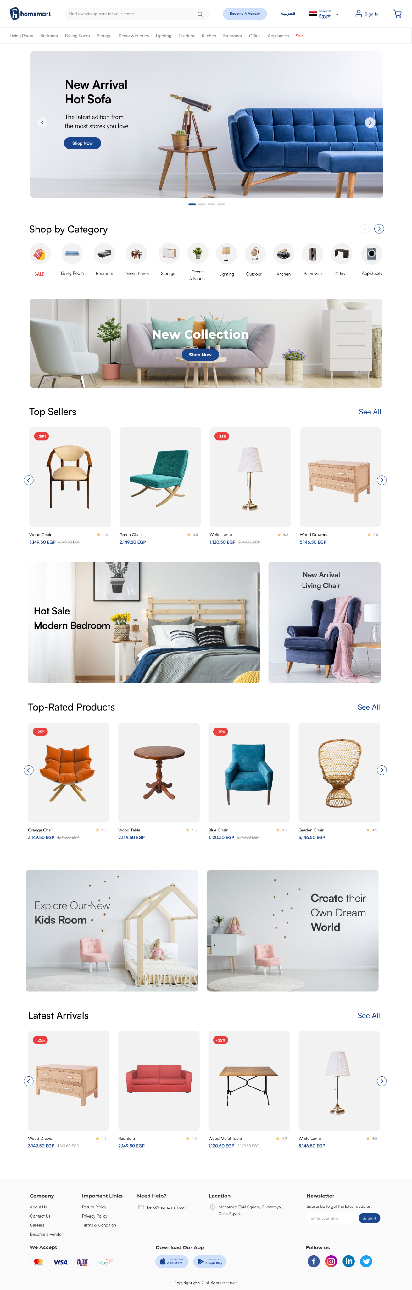
Homzmart redesigned homepage
Scroll to explore the full page

What changed on the screen

  • Room-based navigation
  • Shop by Category
  • Top Sellers
  • Merchandising modules
The goal was to turn the homepage from a promotional surface into a useful starting point for product discovery.
Design Decision 02

Help shoppers find the right product faster

Problem

Users could browse thousands of products, but the existing search and filtering experience did not cover enough product characteristics to help them narrow the catalog efficiently.

Decision

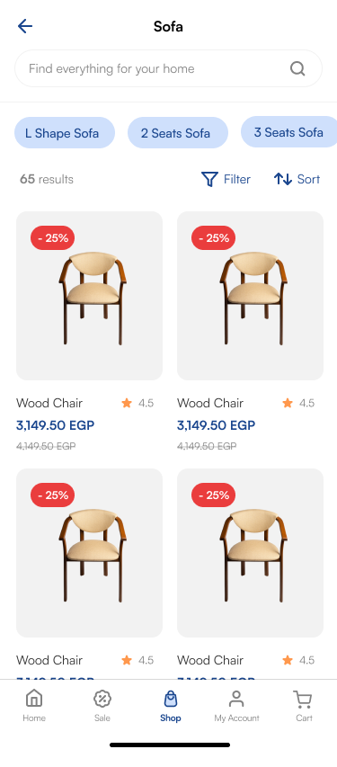
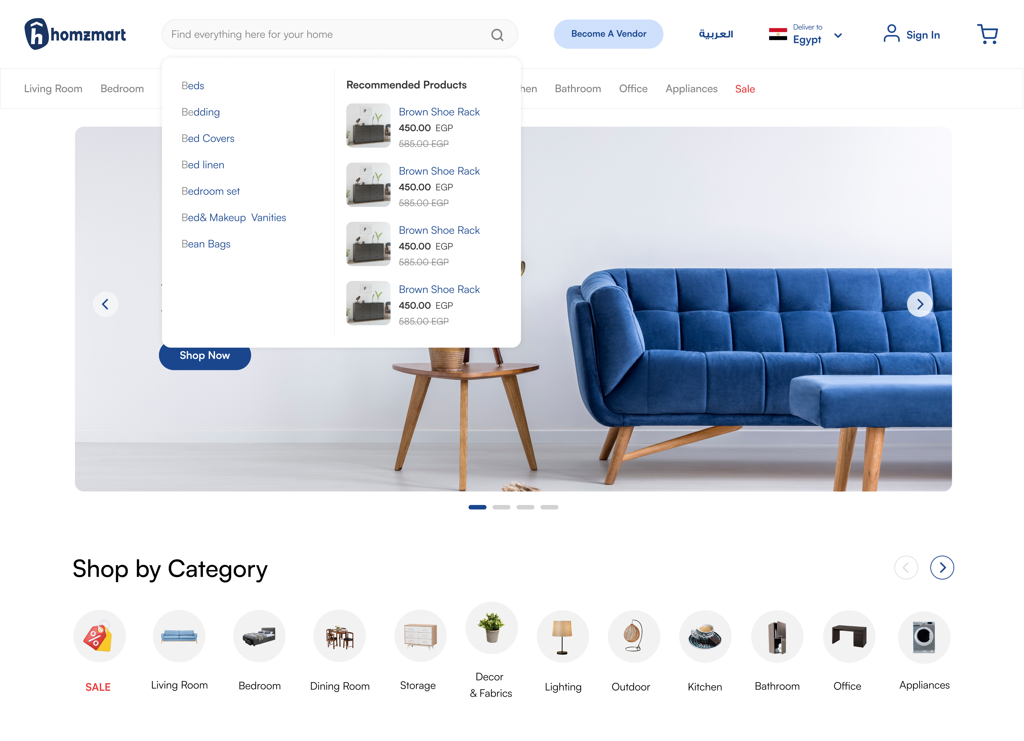
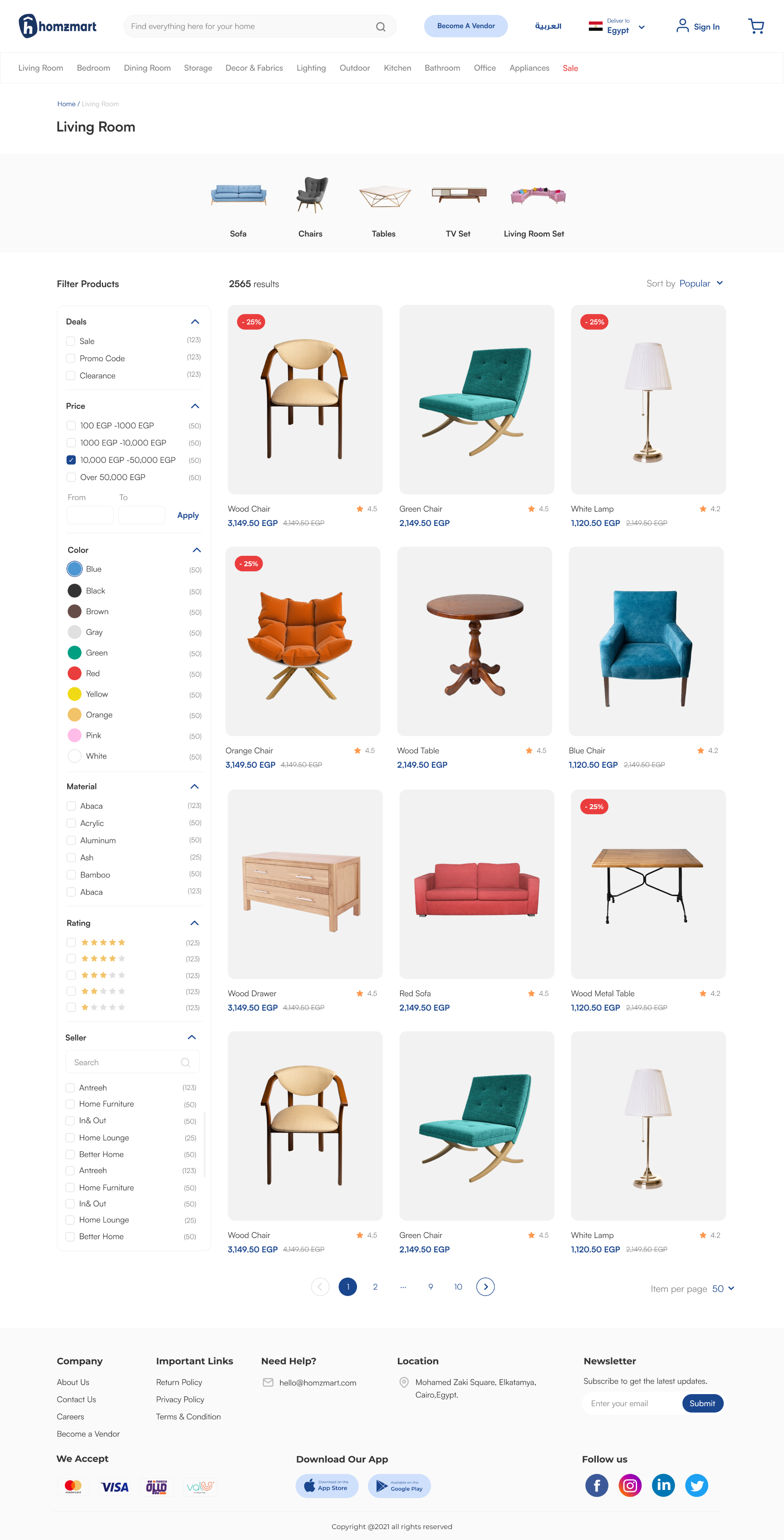
I expanded product discovery through richer search suggestions, recommended products, category navigation, sorting, and filters for attributes such as price, color, product type, sales, and discounts.

Search overlay with suggestions and recommended products
Product list with attribute filters, sort and product count

What changed on the screen

  • Recommended products
  • Category suggestions
  • Attribute filters
  • Sort
  • Product count
Search and filters were designed as decision tools — not just navigation controls.

Design Decision 03

Build confidence in a high-consideration purchase

Problem

Users were hesitant to buy furniture online because they could not physically inspect the product and needed more information before making a relatively expensive purchase.

Decision

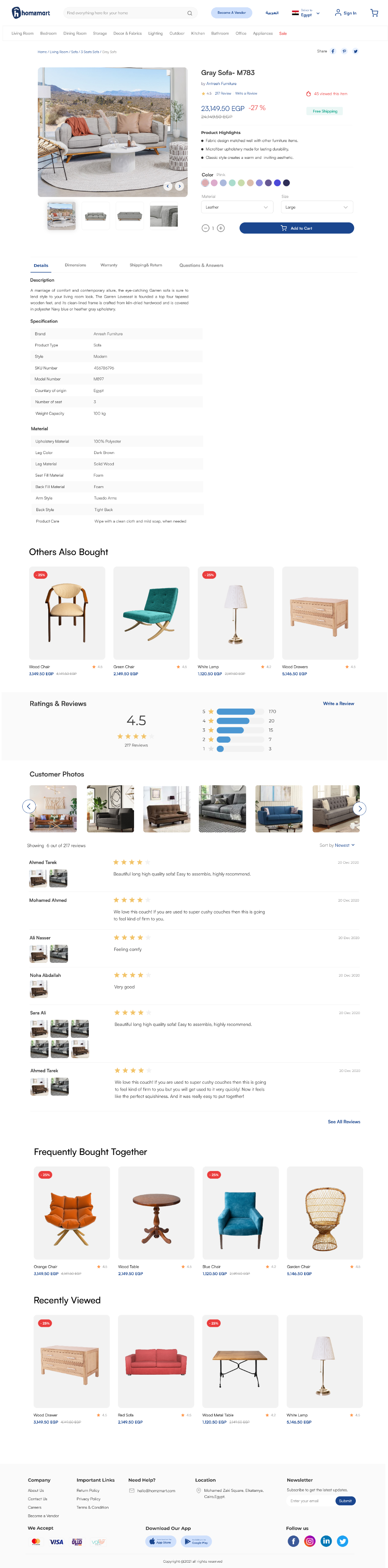
I redesigned the product details experience to answer the questions users were likely to have before buying: What exactly am I getting? Will it fit? Which material or color should I choose? Can I trust the product?

The PDP brought together clearer specifications, dimensions, color and material options, ratings and reviews, customer photos, related products, and sharing options. Sharing was particularly relevant because furniture purchases can involve input from family or other household members.

Homzmart product details page
Scroll to explore the full page

What changed on the screen

  • Product options
  • Detailed specifications
  • Social proof
  • Customer photos
  • Related products
The redesign treated product information as a trust-building layer, not simply a description.

Design Decision 04

Reduce friction at the final step

Problem

Furniture orders involve detailed delivery information and a wide range of payment methods. At checkout, this complexity could become friction just when users were ready to purchase.

Decision

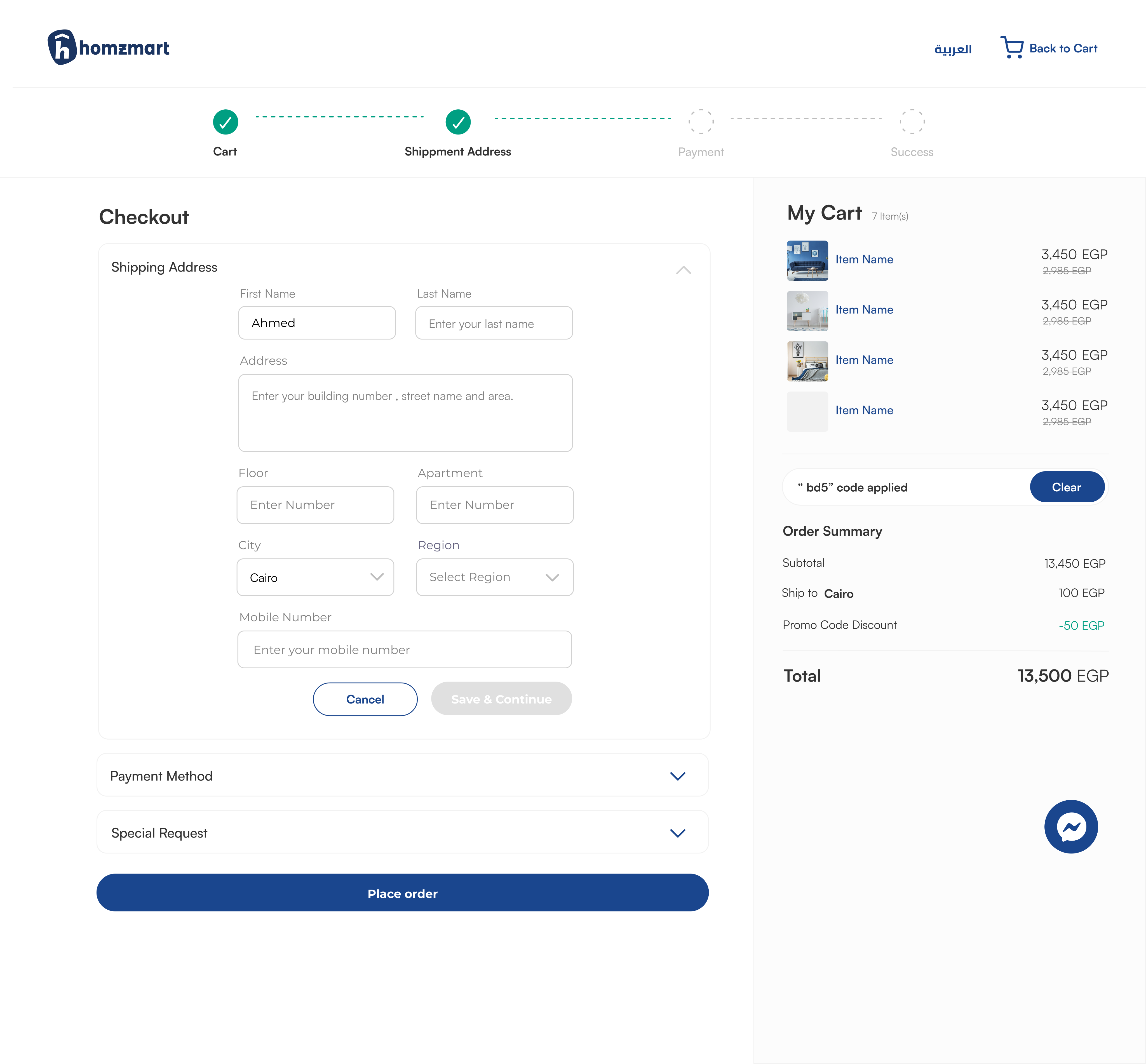
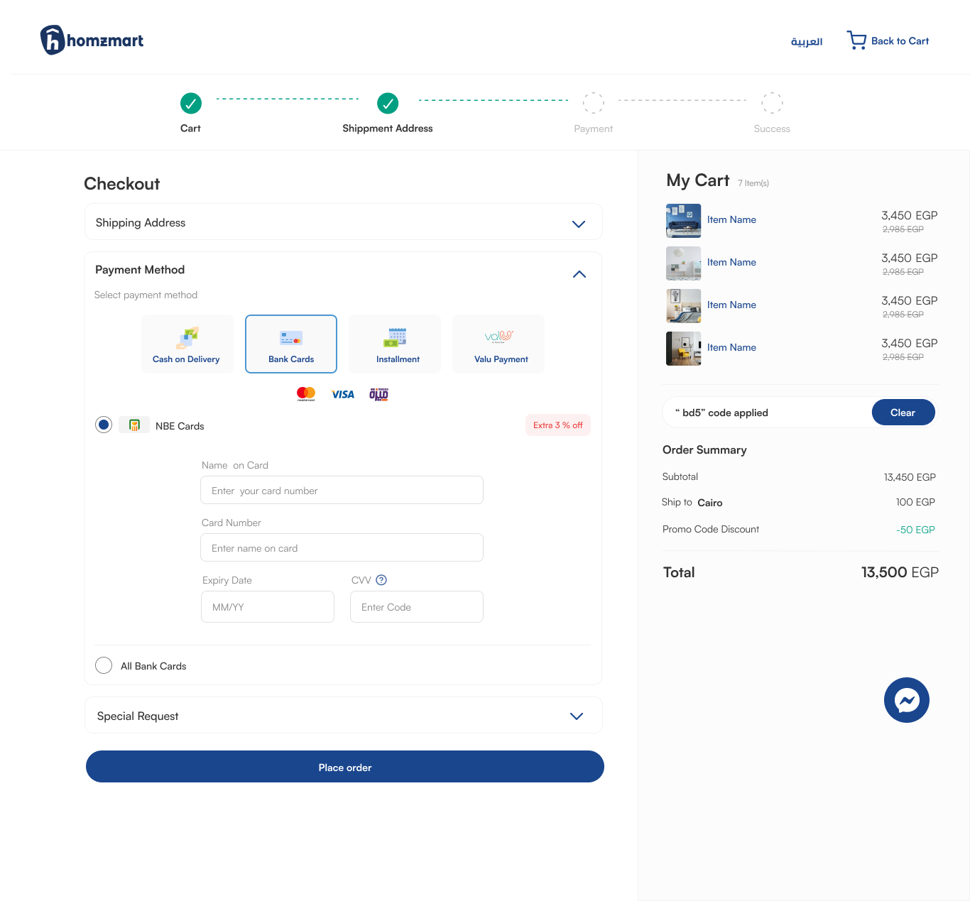
I structured checkout into clear stages so users could understand their progress, expanded the address fields to capture more accurate delivery information, and grouped Homzmart’s payment options into recognizable categories to make comparison easier.

The order summary remained visible alongside the form so shoppers could keep the products, discounts, shipping cost, and total in view while completing the purchase.

Checkout — shipping address step
Checkout — payment step with grouped payment options

Checkout stages

  1. 1Cart
  2. 2Shipping Address
  3. 3Payment
  4. 4Success

Design Decision 05

Create a consistent shopping experience across devices

Problem

Users accessed Homzmart across web and mobile. A different information structure on each platform would increase the learning effort and make product discovery less predictable.

Decision

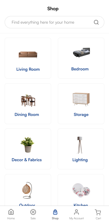
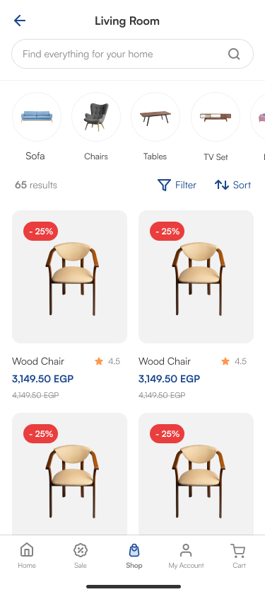
I designed the responsive browsing experience to follow the same mental model as the mobile app, preserving familiar categories, search, filters, sorting, and navigation patterns while adapting them to smaller screens.

Responsive homepage
Responsive menu — categories
Responsive menu — subcategories

06 What the Redesign Enabled

What the redesigned journey was designed to improve.

Easier discovery

A clearer hierarchy, stronger search, and richer filters helped shoppers move through a large catalog with less effort.

More informed decisions

Richer product information and social proof addressed uncertainty before a furniture purchase.

A clearer path to purchase

The checkout structure made shipping and payment decisions easier to understand.

Cross-device consistency

Shared navigation and discovery patterns reduced the gap between web and mobile.

07 Success Metrics

How we planned to measure success.

In collaboration with the product manager, we identified indicators that could help us evaluate whether the redesigned journey was reducing friction and supporting purchase completion.

1

Cart abandonment rate

2

Checkout conversion rate

3

Customer satisfaction

08 Reflection

What I learned.

This project taught me that improving e-commerce isn’t about optimizing individual screens in isolation. Discovery, product information, trust, and checkout all influence the same purchase decision.

Designing the experience end-to-end helped us address friction throughout the journey rather than only at the point of conversion. It also reinforced the value of combining business context, behavioral data, and direct user feedback before deciding what to redesign.

That’s Homzmart.

Next case study Spentify

Let’s Work Together

Have a project in mind? Let’s create something great together.