Designing a personal finance app that turns everyday expense tracking into clearer spending insights and manageable installment planning.
Role
Senior UX/UI Designer
Company
Youxel
Timeline
2020
Product
Personal finance app
Contribution
User Interviews · UX Strategy · User Flows · Wireframing · Prototyping · UI Design
Platform
Mobile app
01 The Challenge
People know they should track their money, but maintaining that habit manually is tedious and easy to abandon.
The challenge was to create a lightweight financial companion that could help users answer three everyday questions:
Where is my money going?
Am I staying on track?
What payments are coming next?
02 My Role
From product idea to mobile experience.
I worked with the product manager to translate the initial product idea into a mobile experience, from understanding user behaviors and defining the core journeys to wireframing, prototyping, and UI design.
User Interviews
UX Strategy
User Flows
Wireframing
Prototyping
UI Design
03 Understanding the Problem
Three recurring problems emerged.
I interviewed three potential users to understand how they currently manage everyday expenses, what usually causes them to lose track of spending, and how they handle recurring payments and installments.
01
Tracking requires effort
Users often relied on memory, notes, or manual records. Small daily expenses were especially easy to forget.
02
Spending is recorded, but not understood
Knowing how much was spent wasn’t enough. Users needed to understand where their money was going across categories and over time.
03
Installments are easy to lose track of
Recurring payments created another mental burden: remembering what had already been paid, what remained, and when the next payment was due.
04 Turning Insights into Product Priorities
Three priorities shaped the experience.
InsightProduct priority
Tracking requires effortMake tracking effortless — reduce the effort required to record everyday spending
Spending is recorded, but not understoodTurn transactions into understanding — transform raw records into useful spending patterns
Installments are easy to lose track ofMake future commitments visible — a clear view of installments and upcoming payments
05 Designing the Experience
Four decisions, one financial companion.
Design Decision 01
Give users an instant financial snapshot
Decision
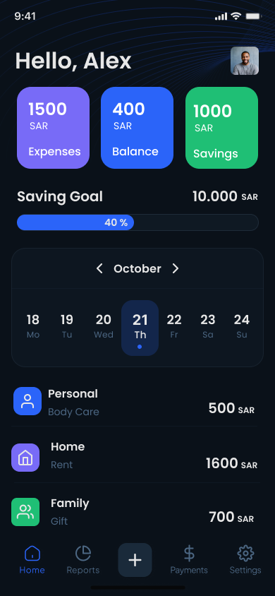
Instead of making users dig through reports to understand their financial position, I designed the home screen as a daily financial snapshot.
What the home screen answers
Total expenses
How much have I spent?
Balance
What do I have available?
Savings
Am I progressing toward my goal?
Recent expenses
Where did my money go recently?
Design Decision 02
Make expense tracking fast enough to become a habit
Decision
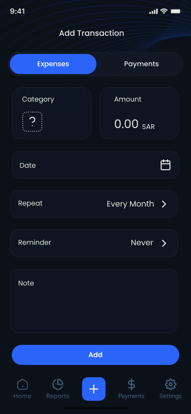
Expense tracking only works if users actually keep doing it. The transaction flow needed to capture enough information to make reports useful without turning every expense into a long form.
What each field is for
Category
Enables meaningful reporting.
Amount + date
Captures essential transaction data.
Repeat
Removes repetitive entry.
Reminder
Supports payments that need future attention.
Design Decision 03
Turn transactions into understandable patterns
Decision
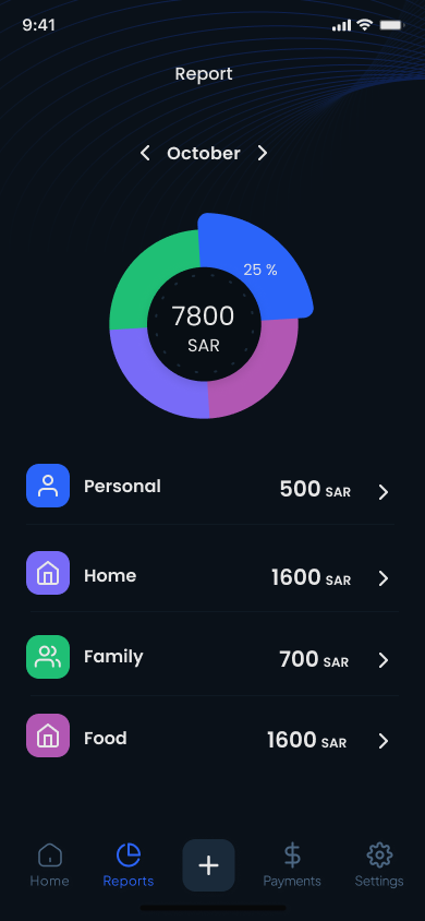
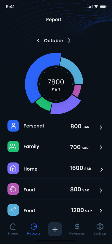
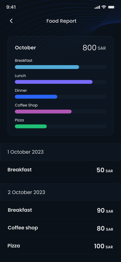
Recording expenses has little value if users still can’t understand their behavior. I designed the reporting experience progressively: from a monthly overview, to category-level spending, and finally to individual transactions.
Progressive disclosure
1Monthly overview
2Category
3Detailed transactions
Design Decision 04
Make installments visible before they become a problem
Decision
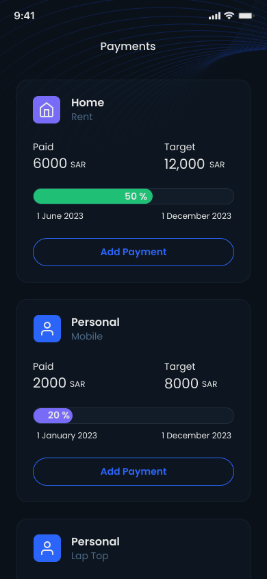
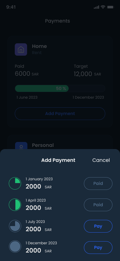
Installments behave differently from everyday expenses: users don’t only need to know what they paid, but also what remains and what is coming next.
On the screen
Paid / Target
Progress
Installment timeline
Paid vs upcoming payments
06 The Experience as a System
Not four features — one loop.
Rather than designing four disconnected features, the experience was structured as a loop: users record their spending, understand their patterns, plan around their commitments, and return with a clearer picture of their finances.
Track
Understand
Plan
Pay
07 How We Would Measure Success
Behavioral indicators defined before launch.
Before launch, we defined behavioral indicators that could help us understand whether users were adopting the core financial-management behaviors.
1
Transaction logging frequencyAre users returning to record expenses consistently?
2
Monthly report engagementAre users using what they recorded to understand their spending?
3
Installment tracking adoptionAre users with installments using the payments feature to manage them?
08 Reflection
The biggest lesson wasn’t about fintech. It was about behavior.
A financial tool can provide detailed charts and features, but it only becomes useful if recording information is easy enough to sustain as a habit.
Spentify taught me to think about the relationship between input and value: ask users for as little effort as possible, then give them something meaningful back.